Choose a color

Paint interestingly !

How to choose the right ceiling color?

Often, when in one of the objects in interior design we have come to the choice of colors for the decoration of the room, the customers are only interested in painting the walls, automatically assuming that the ceiling will, of course, be white. Sometimes it is even worse when, in a project that does not involve author supervision, the masters have painted all the ceilings white without coordination, and then make big eyes when I say that this time a different concept is planned.
I remember how in a new building, where it was decided to paint the ceiling plane of the entire first floor in a light gray tone, the masters sighed and said that we probably intended to turn the house into a cave. Of course, when all the repairs were completed, there was no mention of such an attitude, they were surprised and the customer was delighted!

I agree that the ceiling is the often forgotten fifth wall in the room, the impact of which on the interior is often considered insignificant, perceived as a self-evidently neutral background plane. There is no doubt that a white ceiling will make the room brighter, but other ceiling colors, depending on the tone of the walls, can visually expand the room. In fact, it is with the ceiling plane that it is possible to most successfully change the mood of a room and the psychological impact on a person. Therefore, I have compiled a number of hints and tips on how to best transform the room with the ceiling paint according to your intended result.

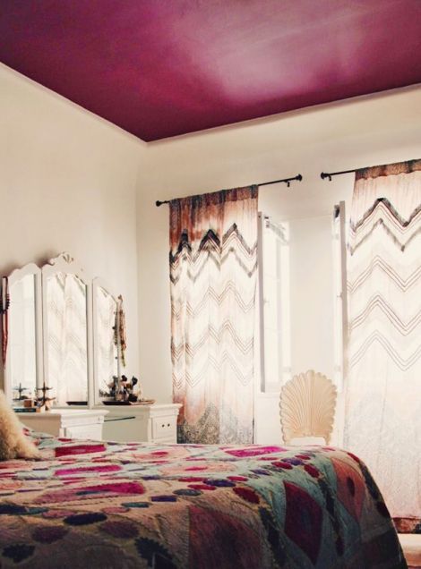
1. A large room with a high ceiling may seem impersonal or disproportionate if the furniture, floor plane and accessories occupy only the lower part of the room, leaving the top “bare”. In this situation, you can experiment with the color of the ceiling in a darker, saturated warm tone, which will make the room more cozy and visually balance.

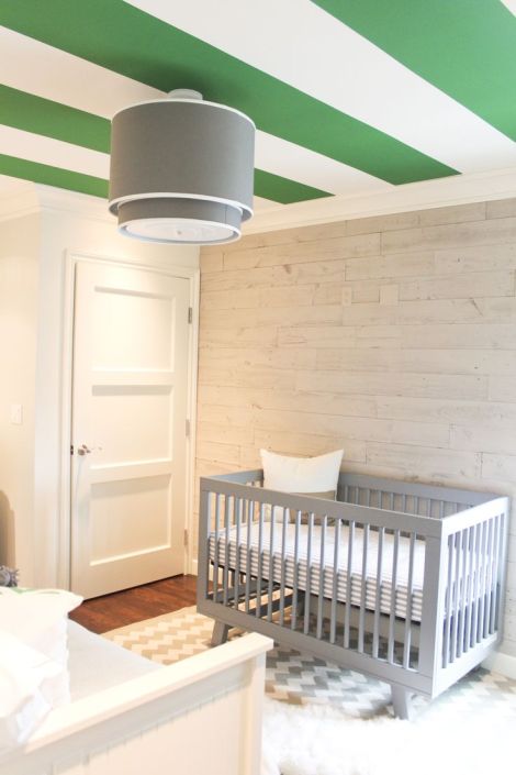
2. If you have decided in favor of a more unconventional ceiling finishing option and you are open to new experiences and changes, the ceiling plane can be painted not only in a different tone, but also create patterns and ornaments on it. Such ceilings fit especially well in children’s rooms, refreshing the monotonous upper part of the room. However, so that such a solution does not clutter the room too much, it is preferable to choose the rest of the room decoration and the tonal palette in inconspicuous, mutually coordinated tones without patterns.

3. If you want to visually expand a small room or make a low ceiling higher, reduce the contrast between the colors of the walls and the ceiling to a minimum. For example, in a room with turquoise blue walls, you choose a lighter shade of blue for the ceiling. In this way, the gaze will be able to smoothly slide from the wall planes to the ceiling, without a strong contrast, which the white color would create (similar to watching the sky by the sea – more pronounced blue at the horizon, “fading” in the direction of the sun.
In small rooms, many choose white ceilings to achieve a feeling of spaciousness. However, in fact, by painting the walls and ceiling plane in the same color, the room will visually expand, because there will be less contrast between the walls and the ceiling.

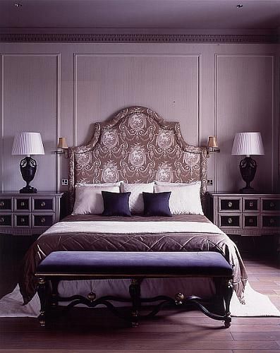
4. For a more harmonious and uniform result, the ceiling and wall colors should be chosen from the same color palette. If it is not necessary to make the room visually higher, you can safely use a darker shade for the ceiling. This will create a more dramatic and elegant effect.

5. In the interior, where the ceiling is too high and lacks such an important coziness, it can be lowered very easily with the color of the ceiling. All you have to do is choose a darker color than the walls, and for the result to be even more effective, paint approximately 30cm from the upper part of the walls with the same color of the ceiling.

6. In interiors, where the ceiling is too high and lacks such an important coziness, the color of the ceiling can be easily lowered. All you have to do is choose a darker color than the walls, and for the result to be even more effective, you should also paint about 30 cm from the top of the walls with the same ceiling color.

7. If you are worried that the ceiling plane will be too dark, you choose a lighter shade from the color palette than you want to see as a result. The ceiling plane always looks darker than the walls because no light falls directly on it. Therefore, it would be safer, at least initially, while you doubt the intensity of the color, to paint the ceiling lighter.

8. It is also good to remember some basic characteristics of colors – warm colors visually appear closer to us, while cool colors visually move away. Since the ceiling is usually too low, not too high, the safest option is to choose a cooler shade.

9. As on the walls, the colors also work with a similar effect on the ceiling. Namely, to accentuate an interesting architectural detail in your home, paint it in a different tone (for example, a ceiling with decorative cornices and panels). On the other hand, by painting anything you want to hide or don’t want to emphasize in the same tone as the surrounding planes, it will visually “disappear”.